

Kiosk Buttons – Appealing Look and Feel
When building an interactive kiosk, your aim is to attract users with an appealing look and feel. InTiles provides you with 40 buttons around the kiosk browser to achieve this aim.
Each button has a Style property that defines the type of content and the layout. The first 5 styles include:
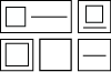 Text with an image – horizontal or vertical layout
- Image only – with or without margin
- Text only
For layouts including an image, the image source is specified in the Image property. This value can be either:
- A local file path (e.g. C:\Users\username\Desktop\Images\button1.png), or
- A URL (e.g. http://yourserver.com/images/button1.png)

The image format used in the default buttons is .PNG 128 x 128 pixels with a transparent background. They were obtained from a free application called Metro Studio 3 by Syncfusion. It includes a collection of over 4,000 Metro-style icon that can be easily customized.
In most cases the image size will adjust to the button size but you have to make sure the image is big enough to retain quality. One exception is when you specify the width/height to adjust to the content (type Auto). Depending on the style used, the button may grow to the image size.
The 6th layout (H for HTML) allows you to display rich web content including live web content such as stock prices and weather. You specify the content in the Content URL text field.
Each button can also have its own background color and font color.
For the 3 layouts with text, the global font specified on the Global appearance tab will be used by default but each button can also have its own font.
Buttons with text will use the Text size and a Text alignment value on the Global appearance tab by default but each button can have it own values.
InTiles provide you with the flexibility to build a visually stunning kiosk interface.

